In Praise of the iOS Icon
Sunday, December 09, 2012 Filed in: Graphic Design | Icons
I have recently discovered and in fact fallen in love with a new art form. While I have always had a soft spot for a well-designed logo or icon, some of the artwork being produced for the iOS platform goes above and beyond when it comes to conveying the perfect amount of visual information while adhering to the confines of an extremely limited format.
As more and more content is produced for the smartphone and tablet market, much of it in the form of third party applications (ok Apple we will call them “apps”), it has become increasingly important to brand ones efforts in an instantly recognizable way. Even more so when you consider the average iPhone has 40 or more apps all vying for that much contested “home screen” space!
While I have had an iPhone since its introduction in 2007 and have been an avid fan of many of the applications since they were made available, I gave little thought to the 57x57 pixel icon that would magically launch the application at my touch, much less to the efforts that went into its creation. I can be partially excused for this oversight when we look back at those early apps with a more critical eye and find that many of their screen icons were rather clumsy in their approach and execution. Corners were clipped, designers hadn’t accounted for the ever-present apple “reflection effect” that was applied to icons by default often with unfortunate results and many app designers opted for photos or some other intricate image that those early pre-retina display phones never had a chance of displaying faithfully.
Much has changed in the last 5 years however and with the broadening of the iPhone market, the introduction of the iPad family and the retina display’s adoption across more and more of Apple’s devices, there is an acute need for high quality, brand-worthy images to accompany the more than 700,000 apps currently found in the iTunes store. Graphic designers and illustrators alike have found much to celebrate in this new visual space and their talents are in increasing demand as both the hobbyist and professional app developer have grown more and more savvy in the visualization of their brand.
The format of the image is a deceptively simple one:
- The active image area is a square with rounded corners. These corners are automatically applied upon uploading the image and are unforgiving. The aforementioned “clipped corners” of the early icons were all victims of a mis-measurement here.
- The artist has a set 512 x 512 pixels to work their magic (iTunes store size), but it should be remembered that it will be viewed at smaller sizes once it is rendered on the iPad and the iPhone, and even that size will change when you consider the retina display dimension requirements.
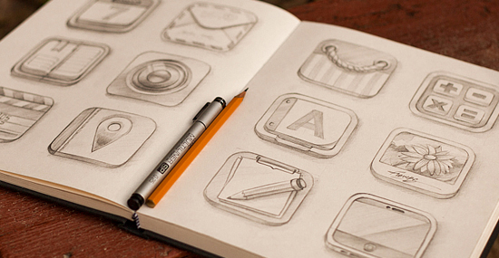
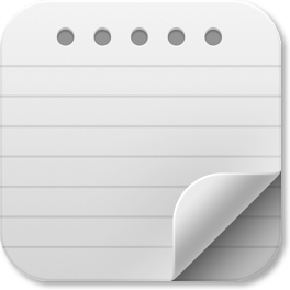
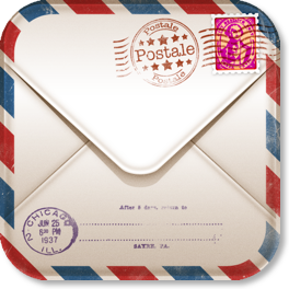
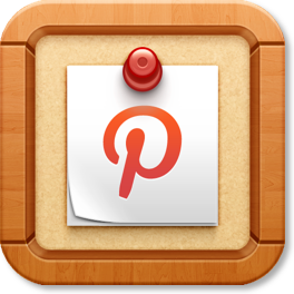
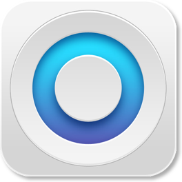
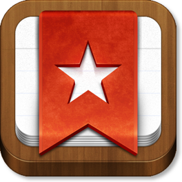
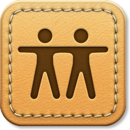
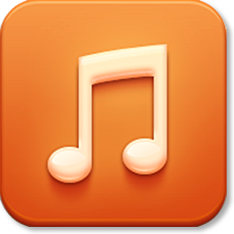
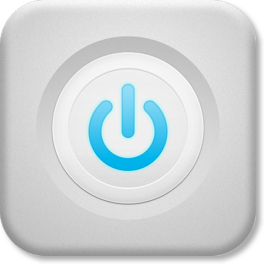
Some of these rely on an understated simplicity:

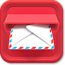
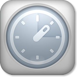
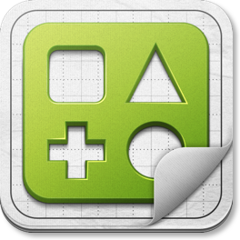
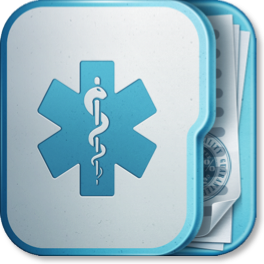
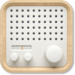
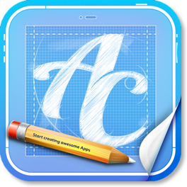
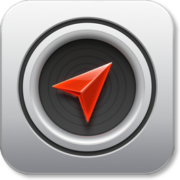
Others play with the illusion of depth:
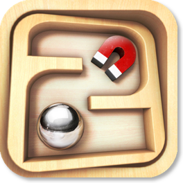
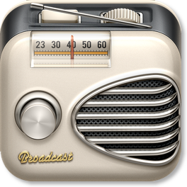
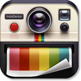
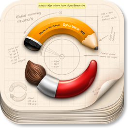
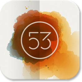
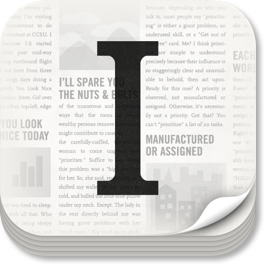
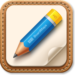
Still others employ a stylized Realism:
Of course in all of this it should not be forgotten that the end goal of these as with any icon is immediate readability. Sacrifice that and it no longer matters how clever your image, how clean the lines, or how vibrant the color. Once the readability is gone you have lost the battle.
As this relatively new outlet of creativity gains momentum, so in turn does the need for the tools and inspiration to make ones own leap into the creative pool. Luckily the internet is there for us and is as hungry as we are for more quality icons and is ready and willing to provide us the tools with which to make them. Take a look at the links below for a handful of such examples. Should you find more during your own research don’t hesitate to pass them along!
As I mentioned before, much has changed. Where I previously gave little thought to these little wonders of artistic achievement, I now find myself downloading a given app if only because its screen icon is more attractive than another app that may serve a similar function. So excited am I by their possibilities I find myself spending my free time re-designing some of my favorites just for fun. I am now looking at this very website’s Home Screen Icon with somewhat less pride than when I created it 10 months ago…it might in fact be due for a little revision!
So take a look at the links below. Scroll down for even more examples of some of my favorite iOS icons. Get in the ring and try your own hand at this excellent new form of visual communication. But let’s watch those clipped corners ok?
Links:
Inspiration:
IICNS - Extensive gallery of iOS Icons
Dribble - Show and Tell for Designers
Tools:
developer.apple.com - iOS Human Interface Guidelines
iOS Icon Template - via Michael Flarup
header image: Mike / CreativeMints
body images: various artists (see first two links)


blog comments powered by Disqus